PRICELINE HOTELS
Helping customers discover our great hotel deals with incremental UX improvements and user research.
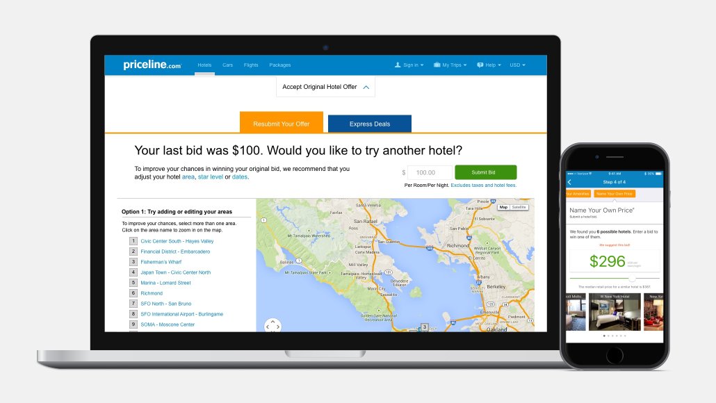 Example redesigns for the Hotels product.
ROLE
- Senior Product Designer & User Researcher on various path-to-purchase initiatives.
PROBLEM AND OPPORTUNITY
-
The Hotels business is the leading revenue driver, making it the most challenging to introduce major UX enhancements.
-
However, the business wants to introduce new features and UX enhancements that allows Priceline to be a differentiator among competitors within a crowded travel industry space.
SOLUTIONS
-
Partnering with product management, I designed various web and app solutions to improve the Hotel booking experience, focusing heavily on reimagining Hotel’s more opaque customer offerings.
-
- Solution 1: Overhauled our legacy Hotels Name Your Price experience by introducing transparent hotels in lieu of a customer’s failed attempts at winning a hotel bid, or ‘Deal Reveals'.
-
- Solution 2: Redesigned iOS user flow of Name Your Own Price.
-
- Solution 3: Northstar final design of Hotels Details page - to be broken out in multiple A/B experiments as they’re introduced into the pre-responsive web design.
DISCOVERY AND IDEATION
-
Designed user flows, iterative wireframe sessions and final UI designs leading to future experimentation.
-
Co-led, and eventually led several user research projects across web and app to understand the habits of our travel customers.
-
Research included card sorting with OptimalSort to identify high priority needs when viewing the Hotel Room Rates matrix.
-
Conducted app surveys and user interviews with our most engaged Priceline users to better understand how to personalize the core App experience.
-
Performed a UX audit of the Hotel booking user journey (path to purchase) to measure against benchmark usability standards.
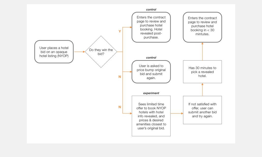 Final user flow for the ‘Deal Reveal’ experiment.
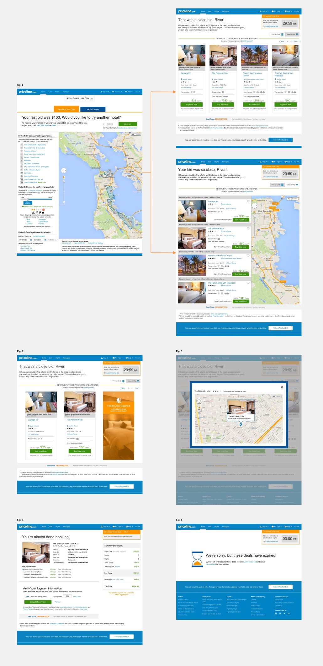 Deal Reveals final UI design. Fig. 1 - NYOP bid page with the UI redesigned from legacy web standards, user lands on a deal reveal page with toggle view options; Fig 2 - Example with fewer revealed hotels; Fig. 3 - Map overlay for revealed hotel; Fig. 4 - Contract/Checkout reservation page; Fig. 5 - Scenario if time runs out.
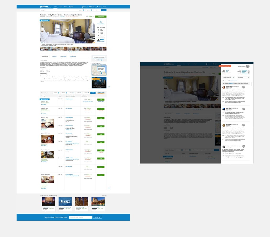 Hotel Details Desktop page with several UI updates to make the page design cleaner and ready for a future-state responsive migration: larger image carousel, hotel information organized by tabs, a reviews slider, Room Rates matrix reorganized.
PRIMARY KPIs
-
Improve quarterly incremental 2% booking/conversion goals for the Hotel business
-
Improve conversion by 2% for our hotel opaque inventory (Name Your Own Price, Express Deals).
RESULTS AND NEXT STEPS
-
The NYOP Deal Reveals experiment scaled on Desktop, showing a 45% improvement in NYOP sales conversion, and an overall 3% lift for NYOP and Express Deal semi-opaque hotel offerings. Next steps are to test and measure the experiment on the mobile website.
-
The Northstar Hotels Details page redesign for Desktop was broken out into several smaller A/B tests. The experiments that scaled included:
- Redesigned Reviews section, which wad converted into a slide-in drawer with a reorganized IA.
- Larger room images in the image gallery.
- A cleaned up, more organized Room Rates table, which was later repurposed to retrofit the mobile website.
-
Next Steps on Mobile App: Synthesize the research findings to better personalize the app and incentivize lapsed customers to rebook through relevant offerings, potentially gamifying the app experience.
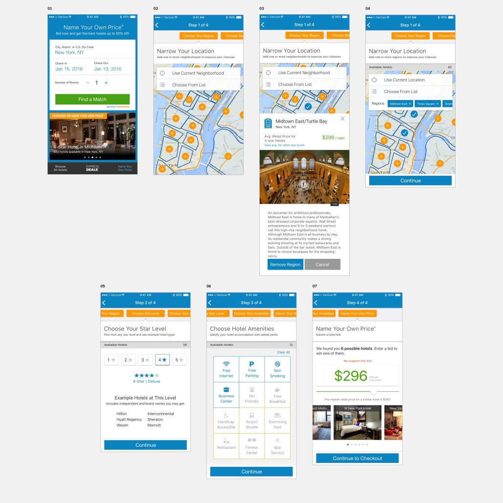 iOS App NorthStar concept for NYOP.
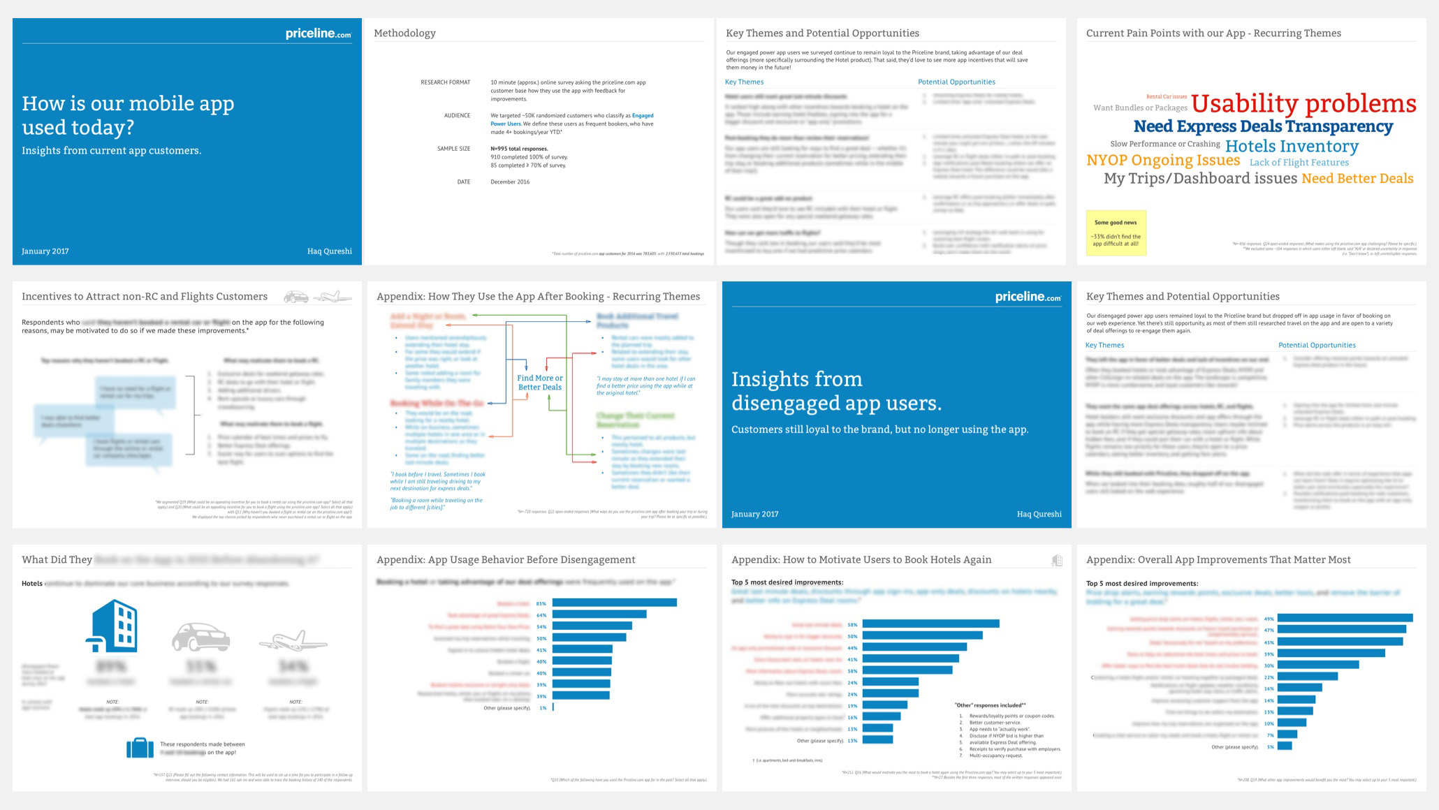 Sample pages (with redacted data) from a user survey I coordinated to help the Mobile business better understand how to engage and re-engage our app users. I partnered with our data analytics to analyze the data before the final presentation.
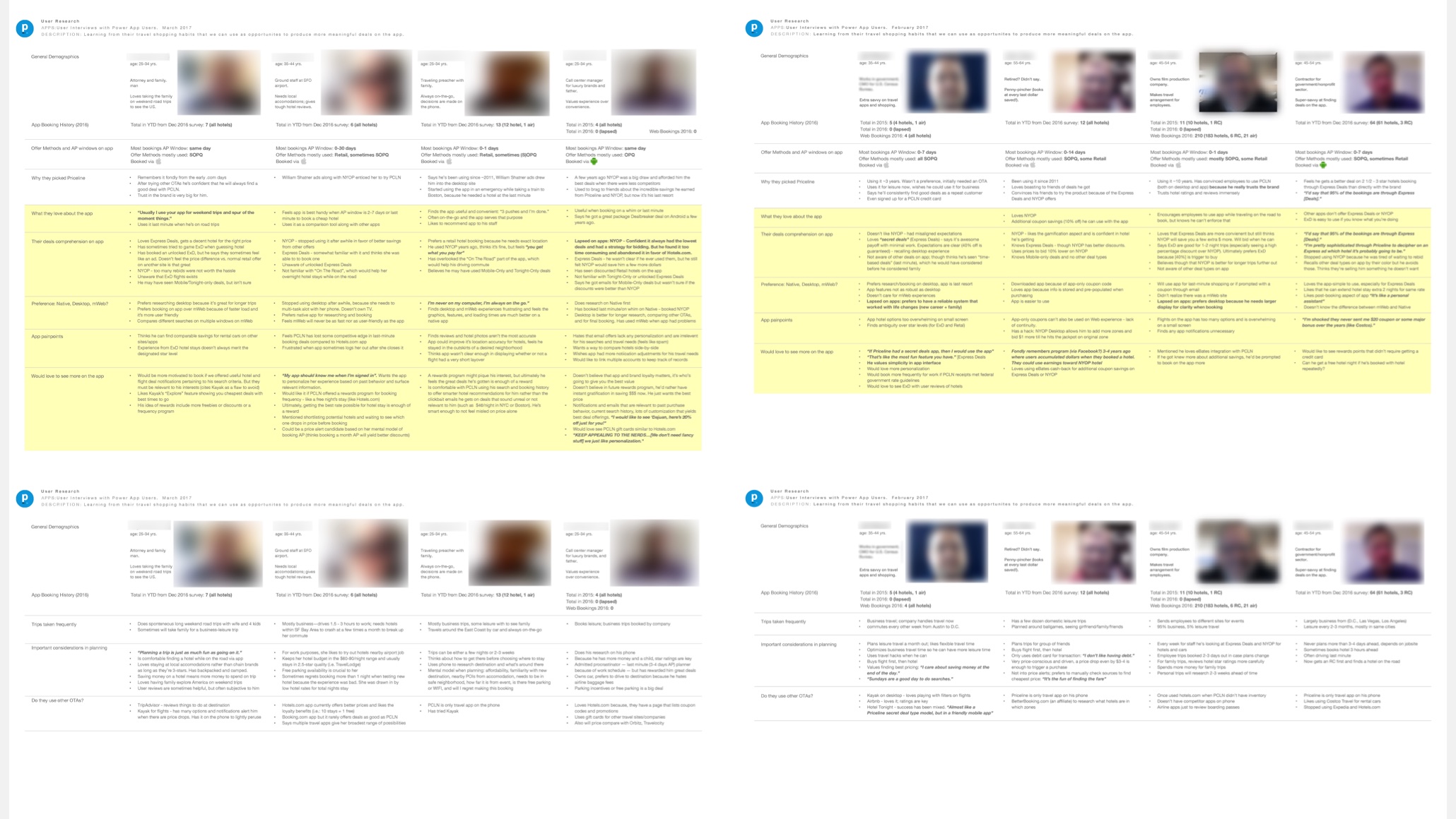 Once some common patterns and user types were emerging from the previous app survey study, I spearheaded a series of 1-hour remote user interviews with some of the survey respondants. The research objective was to understand their behavior patterns when using the app to aid our product leadership into producing more meaningful experiences for our customer base.