BLOOMINGDALE'S RESPONSIVE REDESIGN PROJECTS
Co-leading UX strategy to migrate an ecommerce site to responsive web standards.
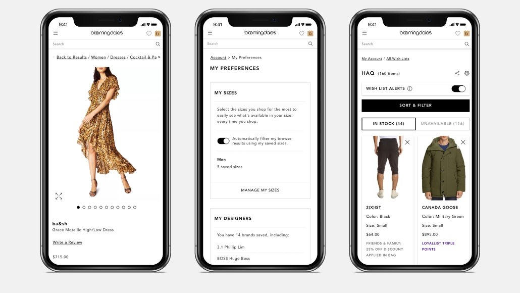 Some example responsive shopping funnel pages that were guided by my UX: Product Details Pages, My Preferences (and larger Account pages), and Wish List.
ROLE
-
Senior UX Designer, lead on Account and Product Selection domains, co-led UX on all Bloomingdale’s responsive projects under UX Manager, including consulting on design direction. Final UI Design credited to our marketing team.
-
Led UX direction on several iOS app-parity features post-responsive web release.
PROBLEM & OPPORTUNITY
-
Before the responsive redesign, the site was hosting a separate desktop/tablet site and an M-DOT mobile website, which became cost-prohibitive.
-
Google’s algorithmic updates favored sending traffic to ecommerce sites with a Mobile-first experience. Our .COM experience needed to catch up with other ecommerce sites that migrated to responsive web.
-
The previous desktop-only and M-DOT experiences led to UX inconsistency due to suboptimal feature parity.
IDENTIFYING A SOLUTION
-
Reinvented the previous Wish List experience into a slick, playful, responsive design layout with improved features aimed at power and casual users.
-
Co-redesigned the UX for the Product Details Page in a responsive design layout with my UX Manager. Afterwards, I designed several additional features on the new responsive grid with the goal of increasing the rate of adding items to Bag, including but not limited to: Store Locator for pickup, inventory availability alerts, UPC enhancements, consolidation of product collections on a single page, and other UX enhancements.
-
Launched several new responsive Account pages, including My Profile, Login, and a Preferences center for Size, Designer favorites, and Communications.
DISCOVERY AND IDEATION
-
I partnered with several business stakeholders on the Product and Analytics side to gather pre-responsive design metrics on click-thru rates across all breakpoints to determine which features to sunset and which to optimize the UX.
-
Utilized feedback gathered from real customer data via our daily site intercept surveys and from 3rd-party user-research vendors to improve and introduce new features.
-
Worked closely along our Site Merchandising teams, frontend and backend software developers, creative UI designers, and executive leadership to guide in the redesign efforts without compromising site performance.
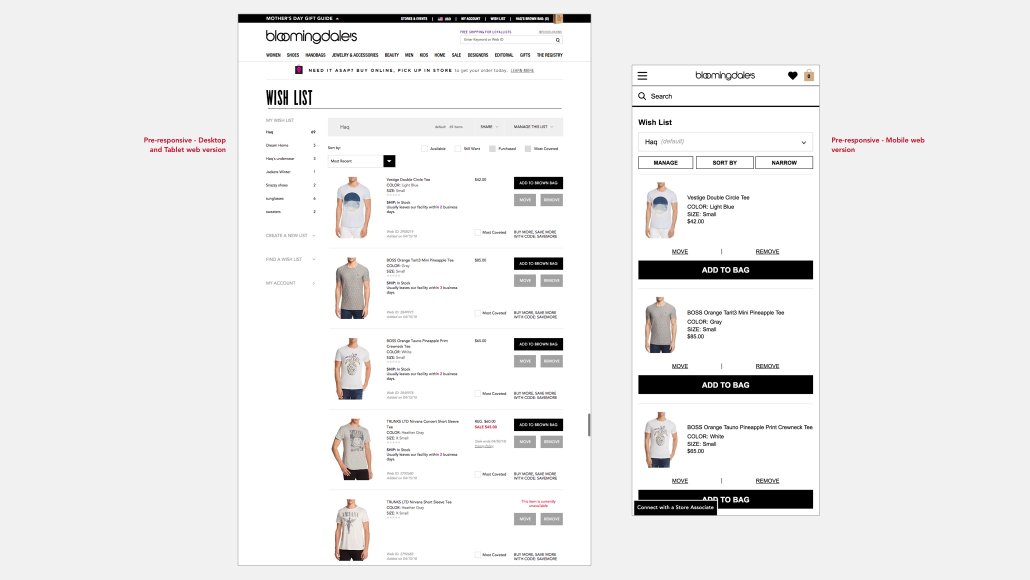 Before the responsive redesign, Bloomingdale’s former Wish List had two separate sites whose UX functionalities were largely inconsistent.
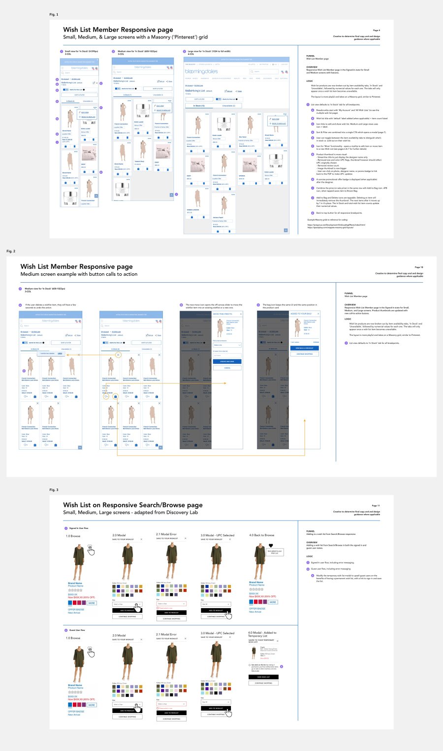 Sample flows of the fluid responsive Wish List wireframes as they evolved. Fig. 1 and Fig. 2 - The new responsive grid layout with CTAs in the form of iconography; Fig. 3 - Examples of saving items to Wish List across the shopping funnel.
 The responsive Wish List today, built on the recommended UX functionality and layout. UI design is credited to our UI Creative team.
PRIMARY KPIs
-
Improved SEO optimization through mobile-first rankings, leading to increased conversion.
-
Improve page performance with a single responsive codebase.
-
Long-term YoY increase in revenue post-responsive launch.
RESULTS & HINDSIGHTING
-
The responsive Wish List, with the redesigned layout and easier-to-use functions saw a 0.3% traffic rise from the previous year once launched. Fewer people deleted their WL items from the previous year (2.4% drop) while there was a strong increase in adding items from WL to their Bag for Checkout (a 3.7% increase). This proved that more customers were engaging with the feature. The WL features later influenced the design of the iOS app experience.
-
The Product Details Page responsive redesigns were scaled, increasing sales on the Mobile Web experience by over 15% the following year. Since the launch, experiments are continually performed to further optimize the experience in the hopes of increasing purchasing rates.
-
After the new Account Profile pages were launched - several features were then designed to retrofit the iOS app. This led to my future collaboration in designing the .COM profile to become increasingly valuable, in which the customer’s online profile could be used to seamlessly identify them when visiting the store, thereby making them omni-channel customers. I worked with our Stores technology team on the POS-side and our Security team to design these updates.
-
Post-launch of the Preferences portal, I worked with our Product Management team to launch a My Sizes toggle to allow users to globally filter products grids based on their preferred size options. Next steps will be to use the Preferences center as a gateway to continue personalizing the customer’s omni-channel shopping experience.
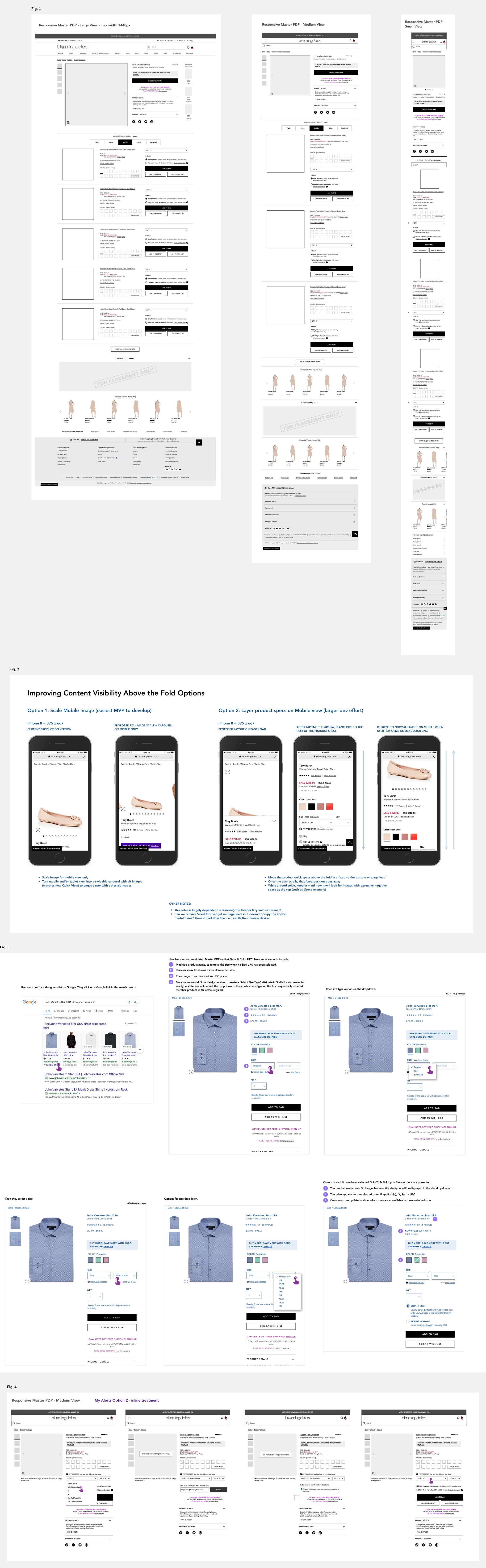 Examples of wireframes and finalized UX flows for our Product Details Page. Fig. 1 - Responsive layouts for our product collections pages (Masters); Fig. 2 - Mobile web recommendations for displaying product details above the fold; Fig. 3 - A flow for consolidating a product with multiple sizes and fit types into a single Details page; Fig. 4 - User flow for creating notifications when items come back in stock.
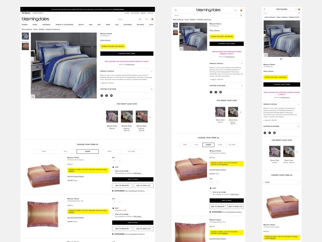 An example of a Master Product Details collection today, built on the recommended UX functionality and layout. UI design is credited to our UI Creative team.
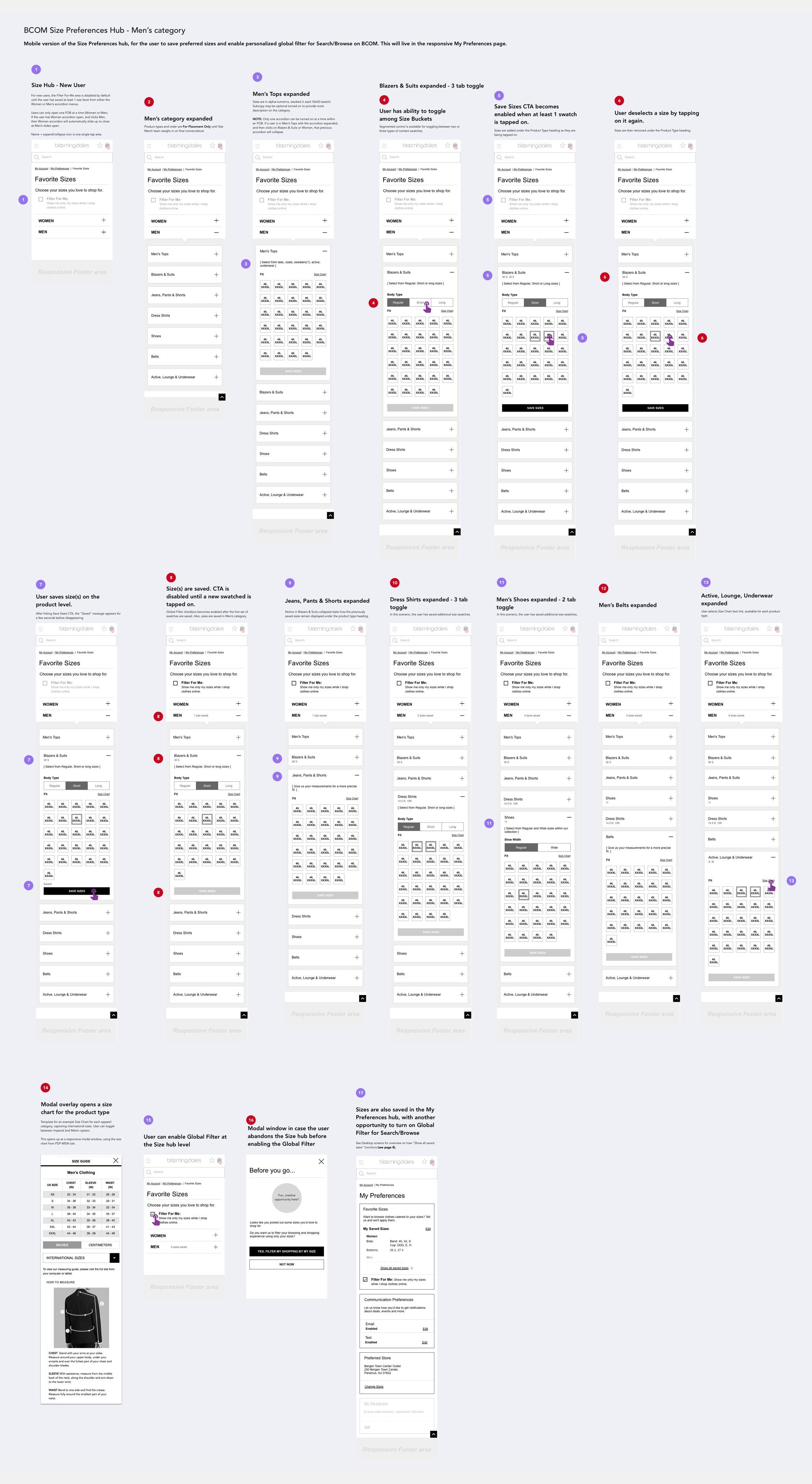 Mobile responsive web wireframe of Size Preferences. Users can save their favorite sizes across numerous apparel types to their omni account. This is the Mens example.
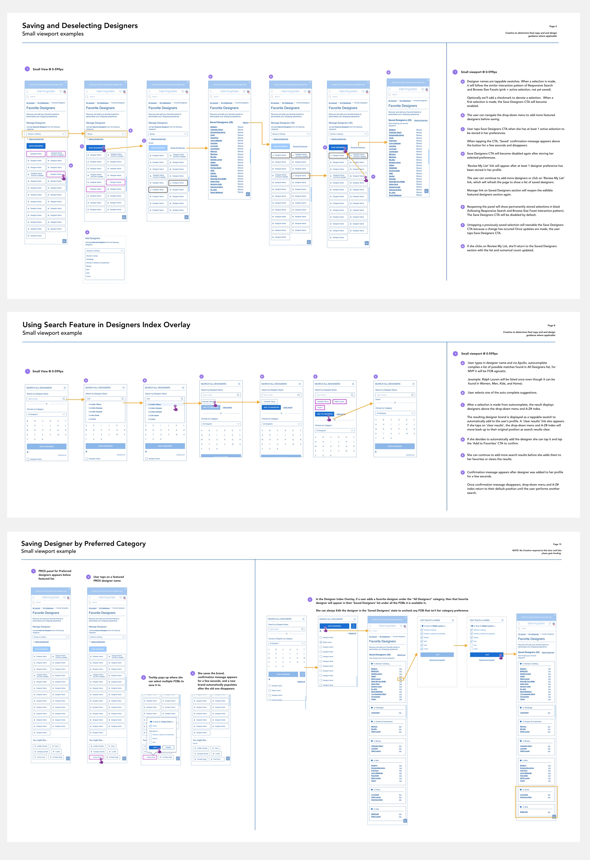 Examples of wireframes and finalized UX flows for the My Designer Preferences hub (Mobile responsive web example shown). Guidelines are created to allow customers to add their favorite designers and brands to their omni account, edit them, and organize them in their Preferences hub.
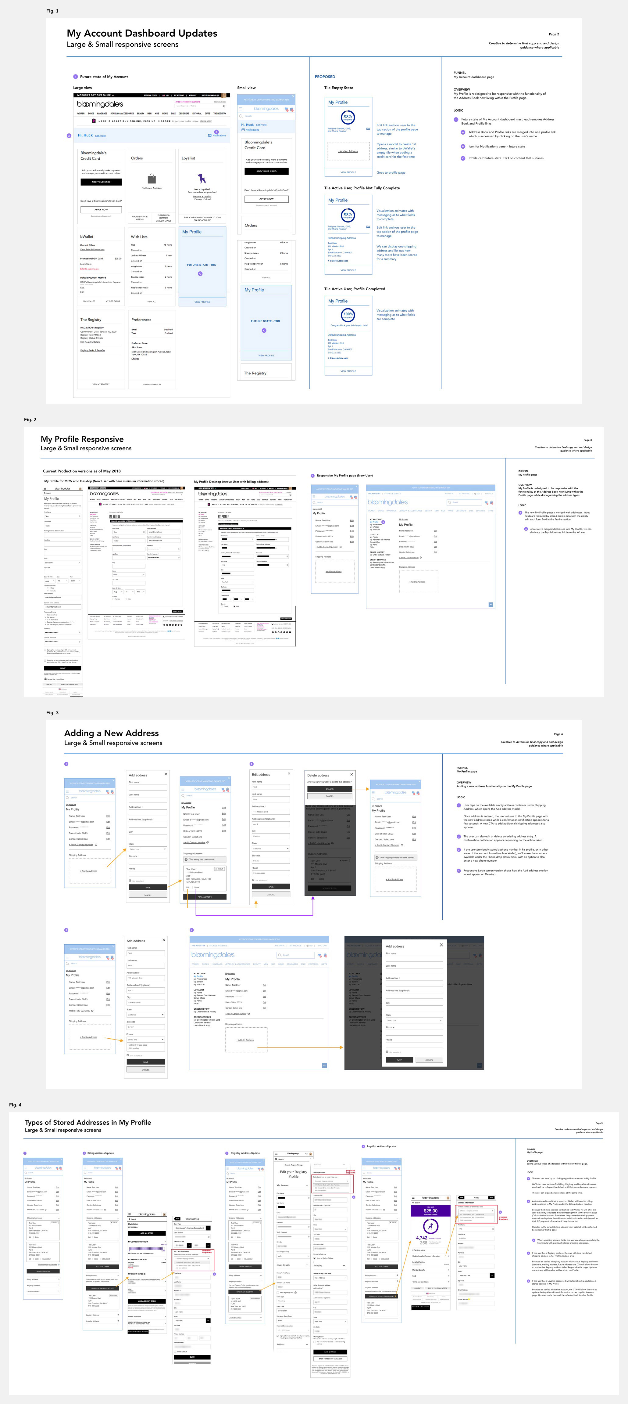 As part of the responsive Account pages redesign, the goal was to combine Profile and Addresses into a single editible section. Fig. 1 - Introduction of the new Profile card on the account dashboard; Fig. 2 - The previous legacy non-responsive layout of Profile shown left vs. the new RWD mobile-friendly UX recommendation with Addresses added; Fig. 3 - Flows for adding a new address to Profile; Fig 4 - Flows for syncing other address types (Registry, Rewards Member, and Billing) into one's Profile.
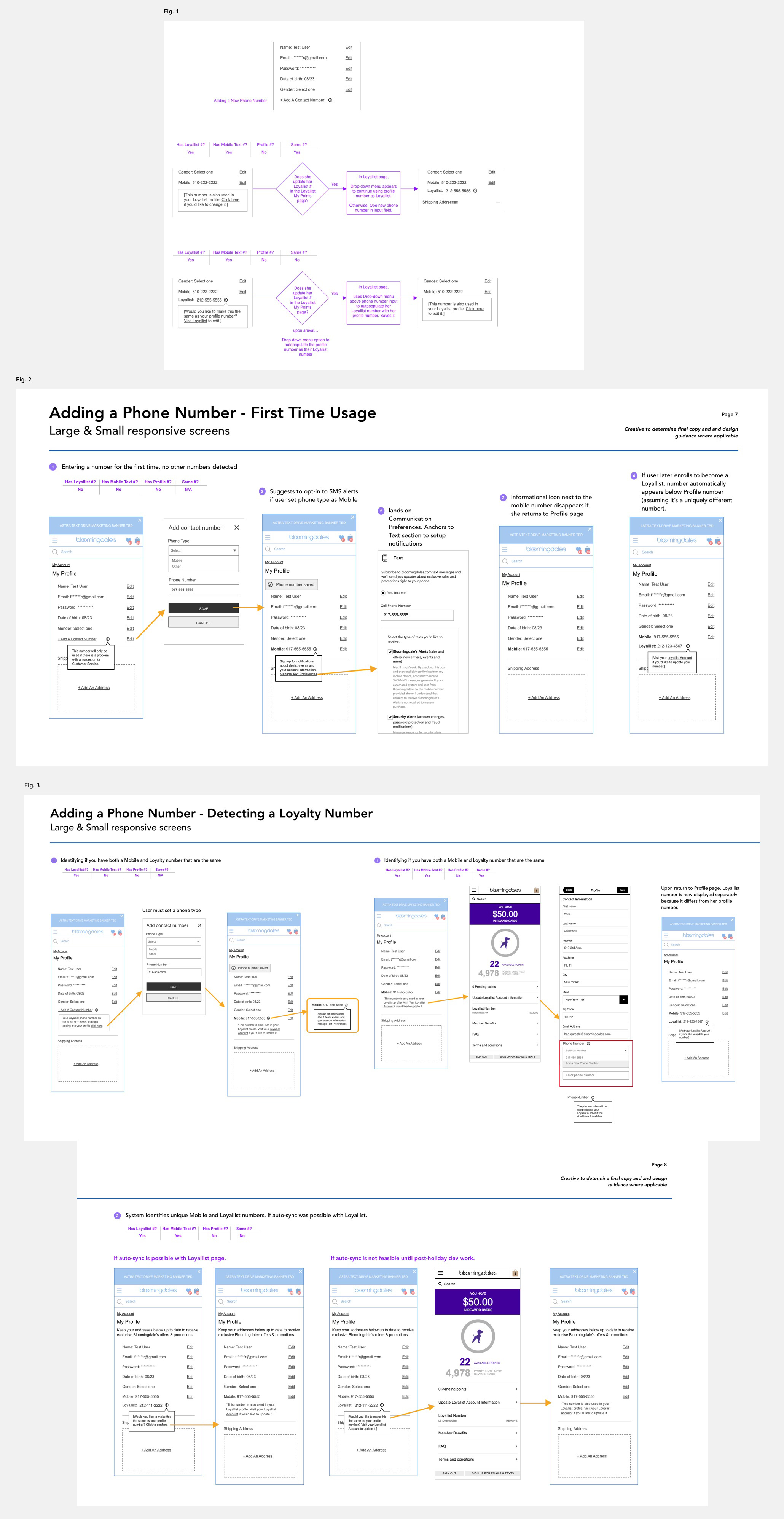 Within Profile, flows were wireframed to establish how to add a phone number for the first time (Fig. 2) and scenarios involving which phone pre-existing phone numbers should be the primary phone for the customer's omni-channel account (Fig. 1 and Fig. 3).
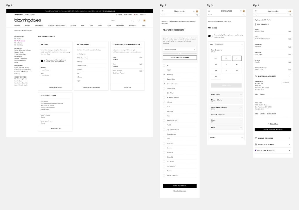 Sample designed pages live today, built on the recommended UX functional requirements and layout. Fig. 1 - The Desktop responsive My Preferences portal in the Account; Fig. 2 - Responsive My Designer Preferences; Fig. 3 - Responsive My Sizes Preferences; Fig 4 - My Profile in Account. UI design is credited to our UI Creative team.