BLOOMINGDALE'S RESPONSIVE HEADER + FOOTER
Building consistent product taxonomy across all devices
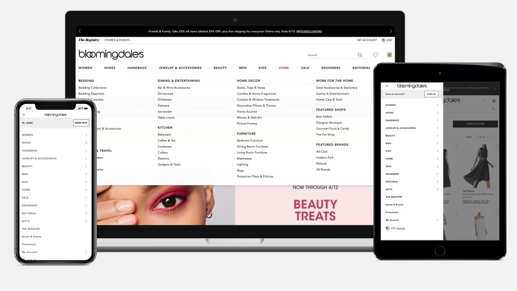 Bloomingdales.com header, a consistent fluid responsive experience across all breakpoints.
ROLE
- Senior UX Designer and lead information architect on the navigational experience on behalf of Bloomingdale's. Final UI Design is credited to our Creative UI team.
PROBLEM & OPPORTUNITY
-
Prior to responsive web, the Bloomingdale’s website hosted separate M-DOT and Desktop experiences with inconsistent navigational categories.
-
Google’s algorithmic changes favored sending traffic to ecommerce sites with a Mobile-first experience. Our .COM experience needed to catch up with other ecommerce sites that already migrated to responsive web design (RWD) in order to not lose valuable revenue from Mobile customers.
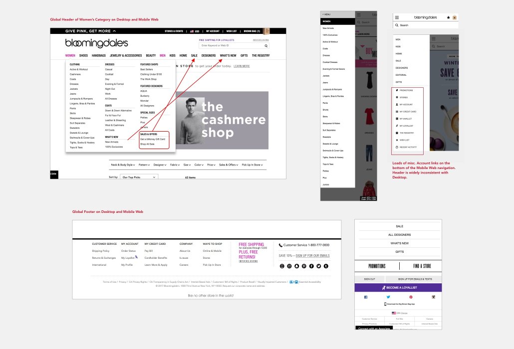 The former global navigation before RWD changes highlighted many inconsistencies in our product offerings and services.
IDENTIFYING A SOLUTION
-
Design and deliver a responsive web experience of our Header + Footer global navigation in a single web application that will create a more user-friendly navigational experience—one that favors a consistent device-agnostic UX of the same content, decreasing the development costs to maintain the experience, and elevating the .COM’s brand image.
-
A single navigational experience captures the .COM’s entire product catalog and becomes the initial source of discovering relevant and inspirational products for users on any device.
DISCOVERY AND IDEATION
-
Designed and iterated on user flows and wireframes of the navigational taxonomy while aligning with engineering & Site Operations teams to best optimize the responsive experience without hurting site speed.
-
This yielded an exhaustive comprehensive 28-page manual of mandated UX wireframes, which captures all the various header and footer types and their responsive web solves.
-
UX recommendations were presented to multiple stakeholding teams across the Bloomingdale’s ecomm business, Site Merchandising, Marketing, Legal, & Stores/Customer Experience teams.
-
Conducted a UX audit of the pre-responsive site, did some competitive analysis, referred to ecommerce usability benchmarks, and relied on intuitive best practices when overhauling the UX of the Header + Footer.
-
Partnered with our analytics, web engineering, and customer experience teams to gather YoY usage data by device prior to responsive migration and collect aggregate customer feedback through our daily site-intercept surveys.
-
Co-authored and co-spearheaded with UX Manager a series of Responsive Web socialization showcases aimed at the Creative and Marketing teams to:
-
Understand the Creative Marketing designers' existing workflow for building site assets in a pre-RWD world.
-
Educate and prepare them for Responsive Web Design, offering best practices on RWD grid systems, how content stacks on Mobile, how to use live text, and other recommended UX and design guidelines.
-
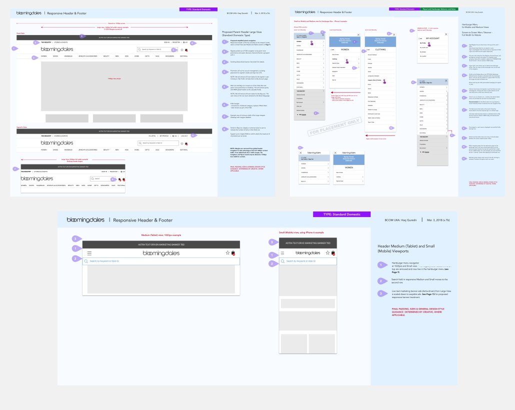 Sample pages from UX wireframes: the final responsive Header for Desktop, Tablet, and Mobile, with annotations on taxonomy hierarchy rules.
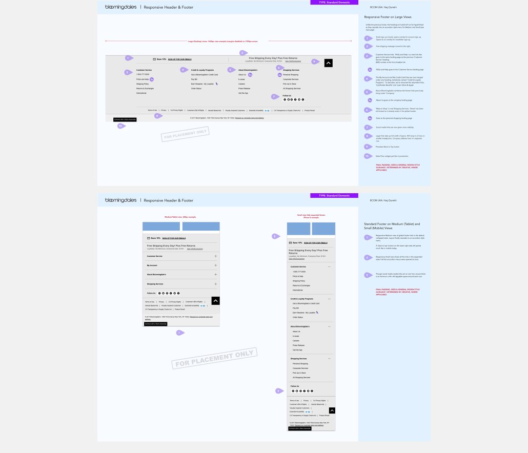 Sample pages from UX wireframes: the final responsive Footer for Desktop, Tablet, and Mobile, with annotations.
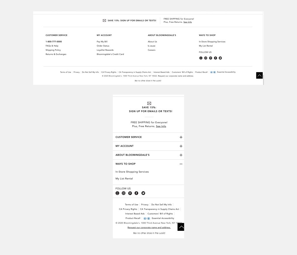 The final responsive footer layout today, designed by the Creative UI team per my UX recommendation.
PRIMARY KPIs
-
Improve Customer Satisfaction scores from our daily site-intercept surveys.
-
Improve overall website performance with a single code stack and a continuous UX experience.
-
Decrease site abandonment rates.
RESULTS AND HINDSIGHTING
-
Responsive Header + Footer was released and eventually scaled alongside numerous responsive migration projects. The new navigation proved to be successful due to the UX recommendation to maintain a single source of merchandising data to power the Desktop, Tablet and Mobile headers for a consistent experience across devices. This allows any merchandising and product teams to adopt new feature enhancements across one codebase and not have to update multiple databases.
-
There were some UX concessions—I worked with the confines of our existing CMS, which due to dev resource constraints, forced me to modify my original Header flyout grid layout from 5 columns to 4.
-
Next steps to further refine the header: collaborate with creative UI team to improve the visual display, improve Search visibility & functionality post-responsive retrofit, potentially streamline the header navigational content by relegating some product sub-categories into filters.
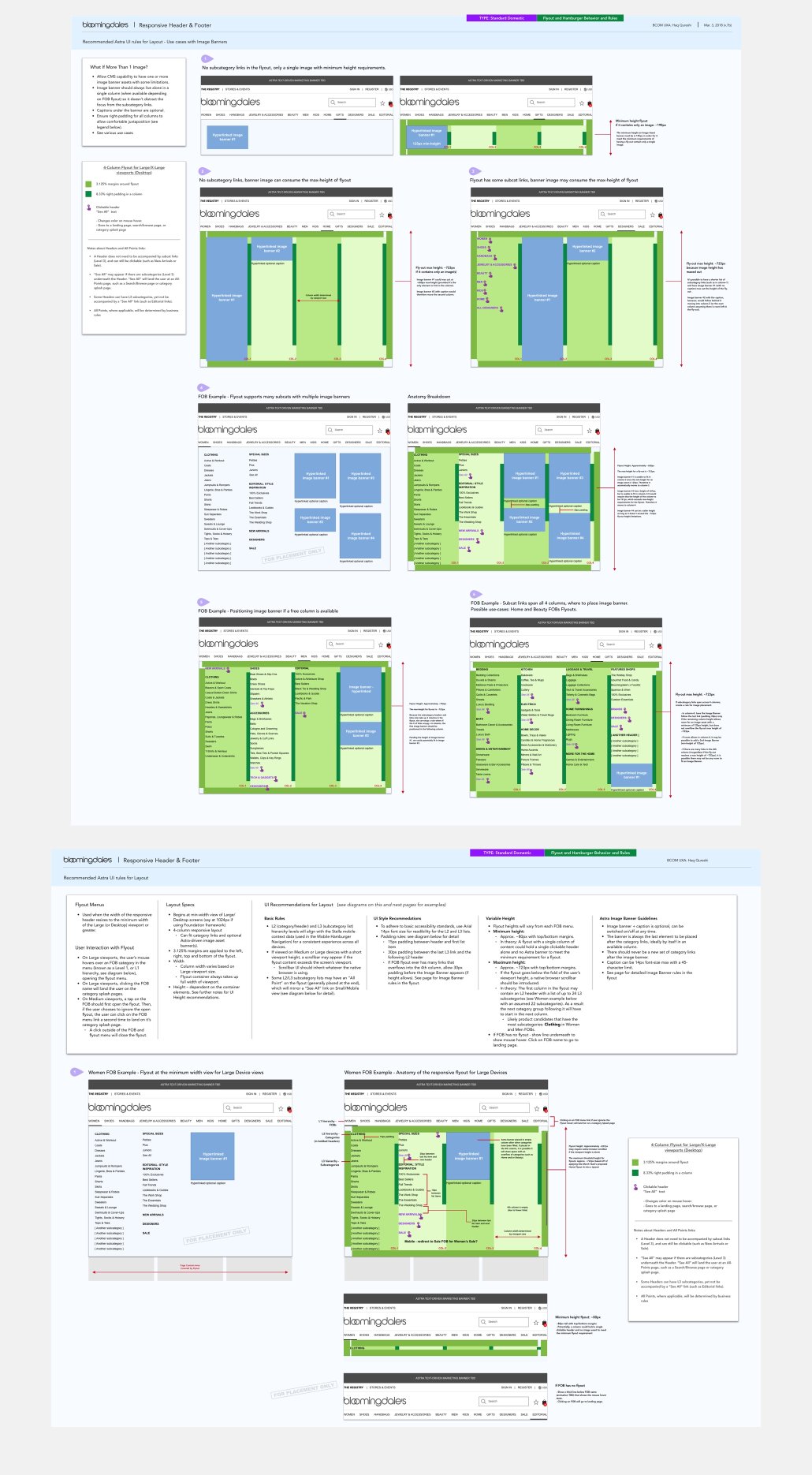 Sample pages from UX wireframes: On the responsive Desktop flyout I created guidelines for navigational hierarchy, spatial layout rules with max-height and max-width, and handling possible grid layouts with image assets on the flyout canvas, as controlled by our CMS.
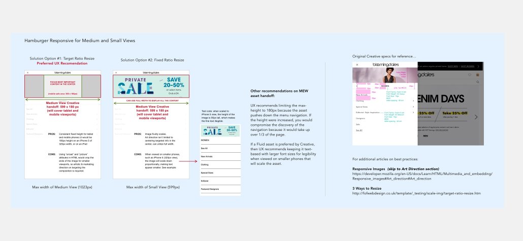 Some image asset guidelines I created for our Creative Marketing team for designing Mobile-responsive assets on the hamburger menu.