Bloomingdale’s iOS App: In-Store Guide Features
Designing app features that connects you to the physical store
 Several new In-Store app features were introduced (and are still in the works) that were built with my user flows and interactions. Examples displayed in cluse In-Store Maps, Contextual Product Recommendations, and Buy Online Quick Pickup In Store.
ROLE
- Senior UX Designer leading all of the App In-Store Guide experiences on behalf of Bloomingdale’s, owning UX strategy and user flows. Consulted on design direction. Final UI credited to our marketing design team.
PROBLEM AND OPPORTUNITY
-
The customer shift to online shopping has led to less traffic at the physical brick-and-mortar stores. Yet strictly shopping online has it’s disadvantages: customers want to be able to see, feel, or try-on the products and not having the colleague-to-customer interaction is a pain point.
-
Our stores have a competitive advantage over ecomm-only retailers in providing a potentially rich omni-channel experience (i.e. the online shopper can also be a store shopper). The more exposure of available services and goods at the store from online/app, the more frequent the in-store visits will become, creating a seamless continuous shopping experience.
IDENTIFYING A SOLUTION
-
Redesign Bloomingdale’s iOS App’s In-Store Guide in order to streamline the layout and introduces new features to connect the app customer to the store.
-
These iOS App In-Store Guide features included: Buy Online Pickup In Store Quick Pickup to allow customers to quickly track and pickup deliveries made to the store from the app (including enhancements to improving discovery and overall information architecture to their Order Details Page for Store Scanning; wayfinding from the app using Store Maps; displaying relevant Product Recommendations to the customer while at the store; enhancements on Scanning Items & Self-Checkout while at the Store, and many more.
DISCOVERY AND IDEATION
-
I collaborated with several cross-functional Product, Marketing, and iOS engineering teams to gather business requirements, ideate on several iterative wireframe and user-flow solutions, and understand how to work within the underlying code stack to propose updates.
-
Worked with several product managers across Bloomingdale’s and Macy’s to gather Localytics data and other metrics to determine design solves.
-
Collaborated and drafted a usability study with my product manager and our 3rd-party research vendor to gather user feedback on our Store Maps pilot.
-
Met with numerous store employees in New York and San Francisco, including floor associates, style experts, and managers, to understand store colleague pain points and rapid-test proposed design solutions for some of the In-Store features.
-
Co-authored a survey study with my UX peer and our Customer Insights team to determine how to brand our In-Store Guide tools.
-
Implemented several UX best practice workflows for our app features, which later influenced our Macy’s Product and UX teams in their respective versions of the features (including Store Maps, re-architecting our App Order Details pages running on legacy code standards, and improvements to the overall Scan-In-Store capabilities).
PRIMARY KPIs
-
Increase engagement/usage of App while in a Bloomingdale’s Store.
-
Increase in-store sales through the app.
-
Increase Net Promoter Score while shopping with the app in store.
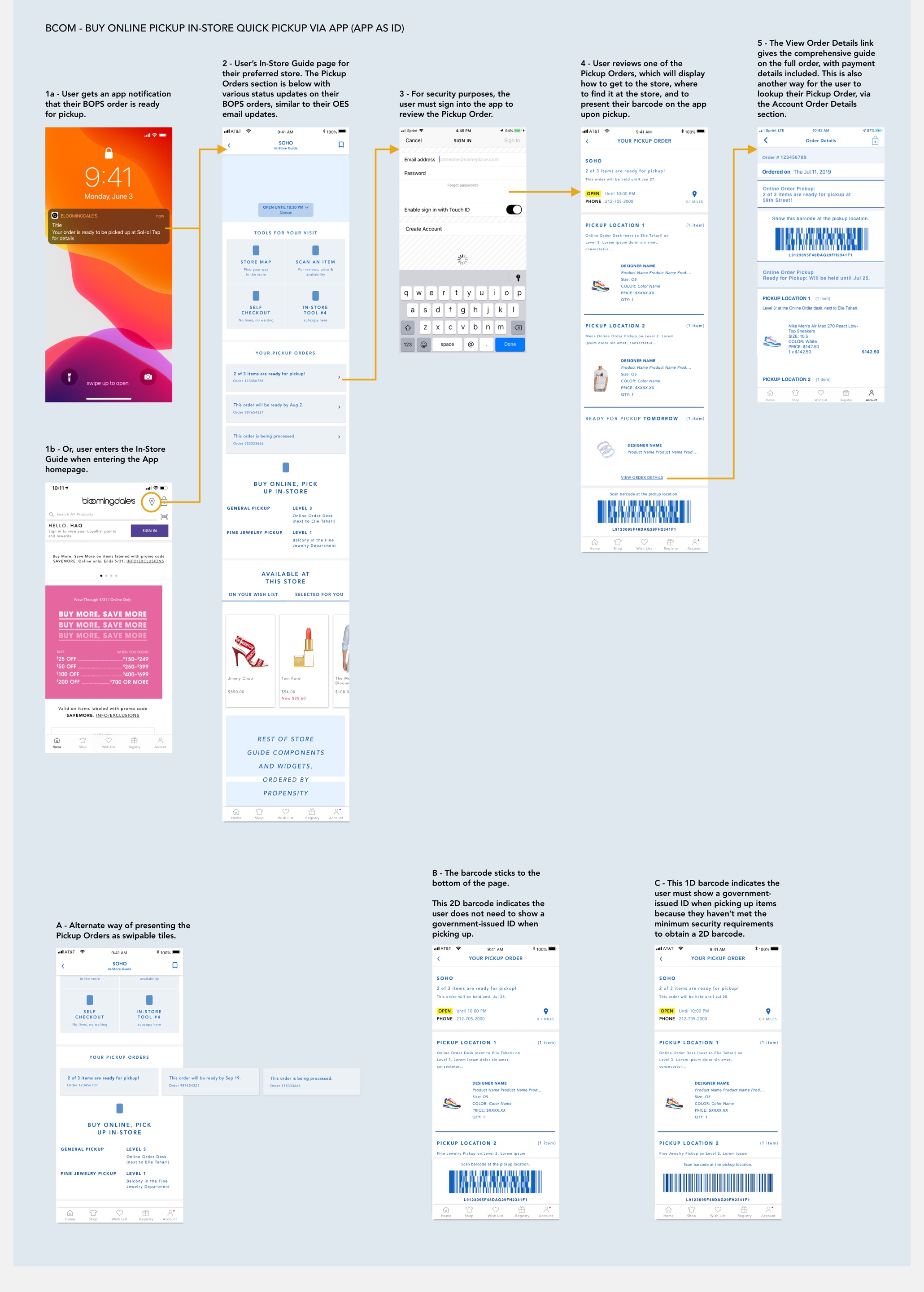 Example user flow for an App as personal ID project: for customers picking up items they bought online at the store, they can easily get an app notification, which allows them to pull up their Quick Pickup order when they’re near or at the store, and have an immediate barcode scanned by the store colleague.
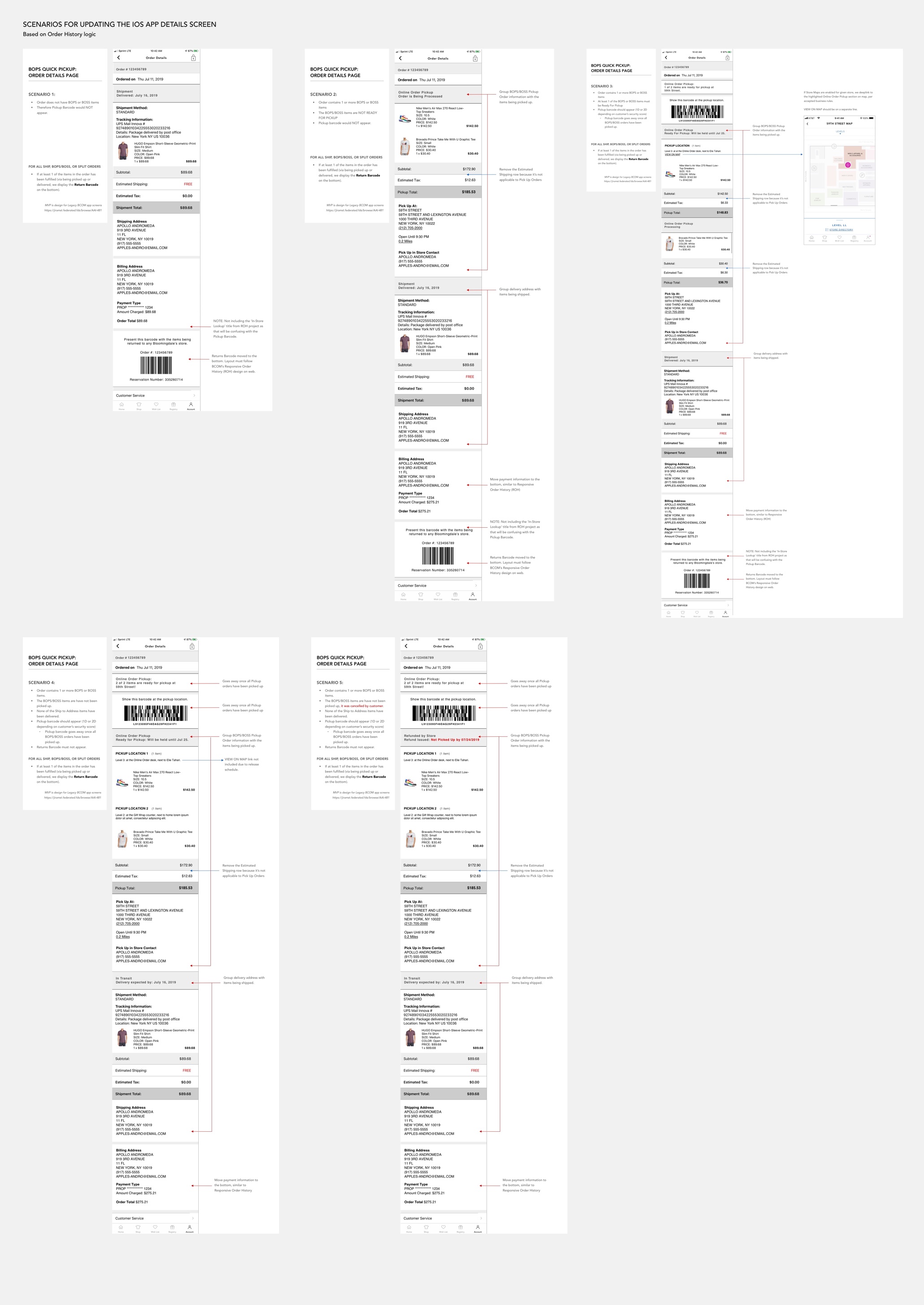 This also required rearchitecting the App’s Order Details screen hierarchy (which lives in Account) from previous legacy standards. Research showed that Buy Online Pickup In-Store customers were also trying to access their Quick Pickup Order, and subsequent barcode, through their Account. Extensive UX work was done to identify the existing order history logic rules and then logically restructure the screen to remove redundant invoice messaging, then reorganize and streamline the content.
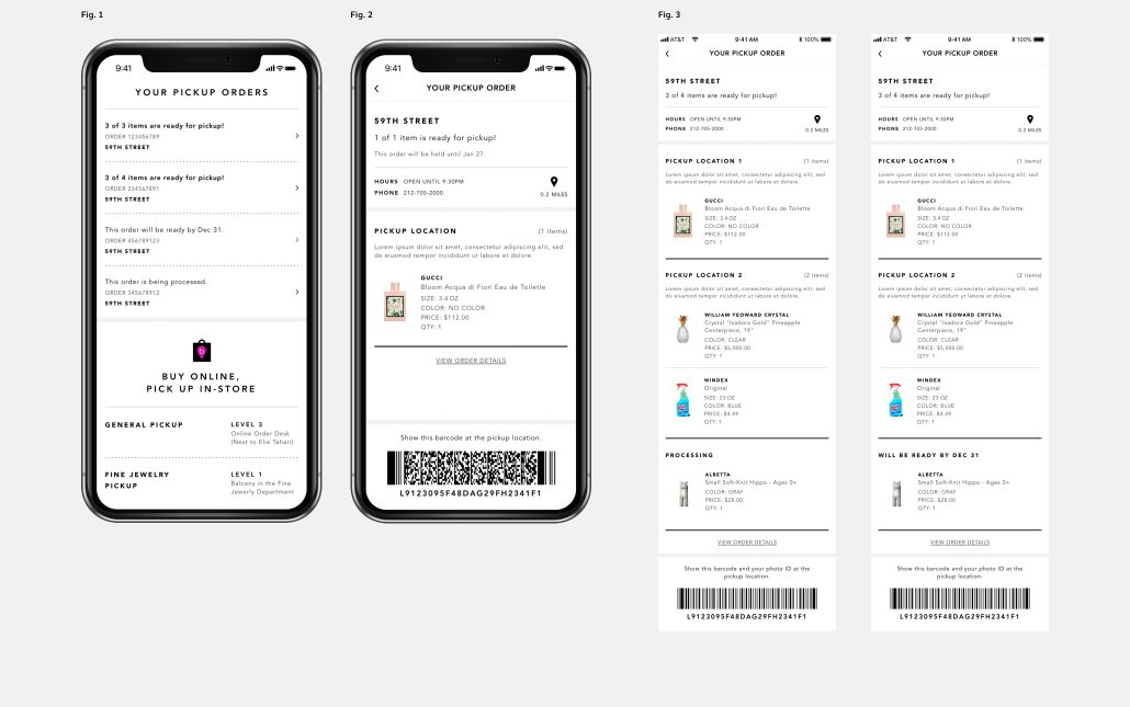 The live screens from In-Store Guide, following UX recommendations. Fig. 1 -Your Pickup Orders widget appears in the In-Store Guide; Fig. 2 - Details on a specific pickup order with 2D barcode; Fig. 3 - Orders that are partially ready to be picked up, with a 1D barcode. UI design is credited to our UI Creative team.
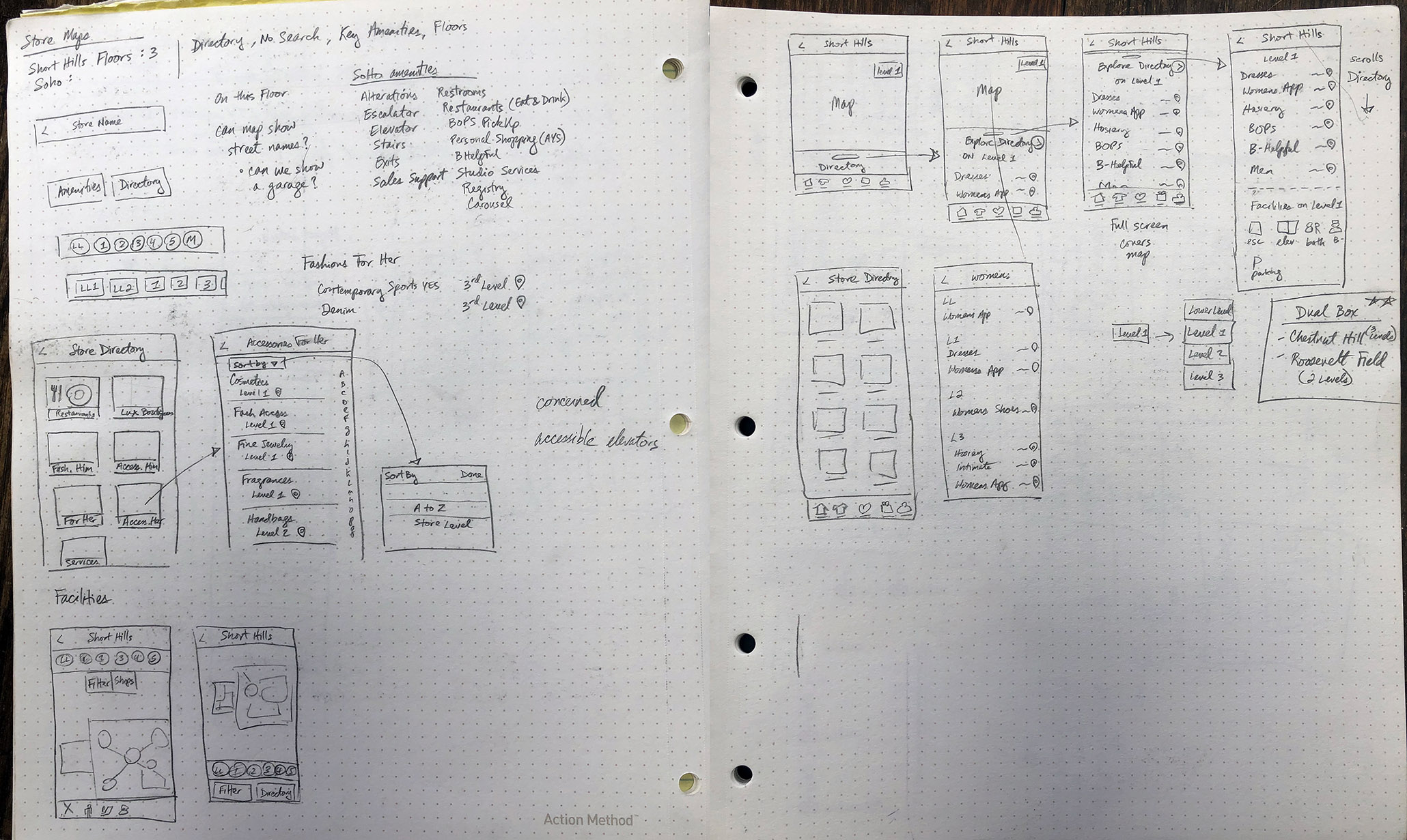 Initial discovery concepts for the Store Maps designs.
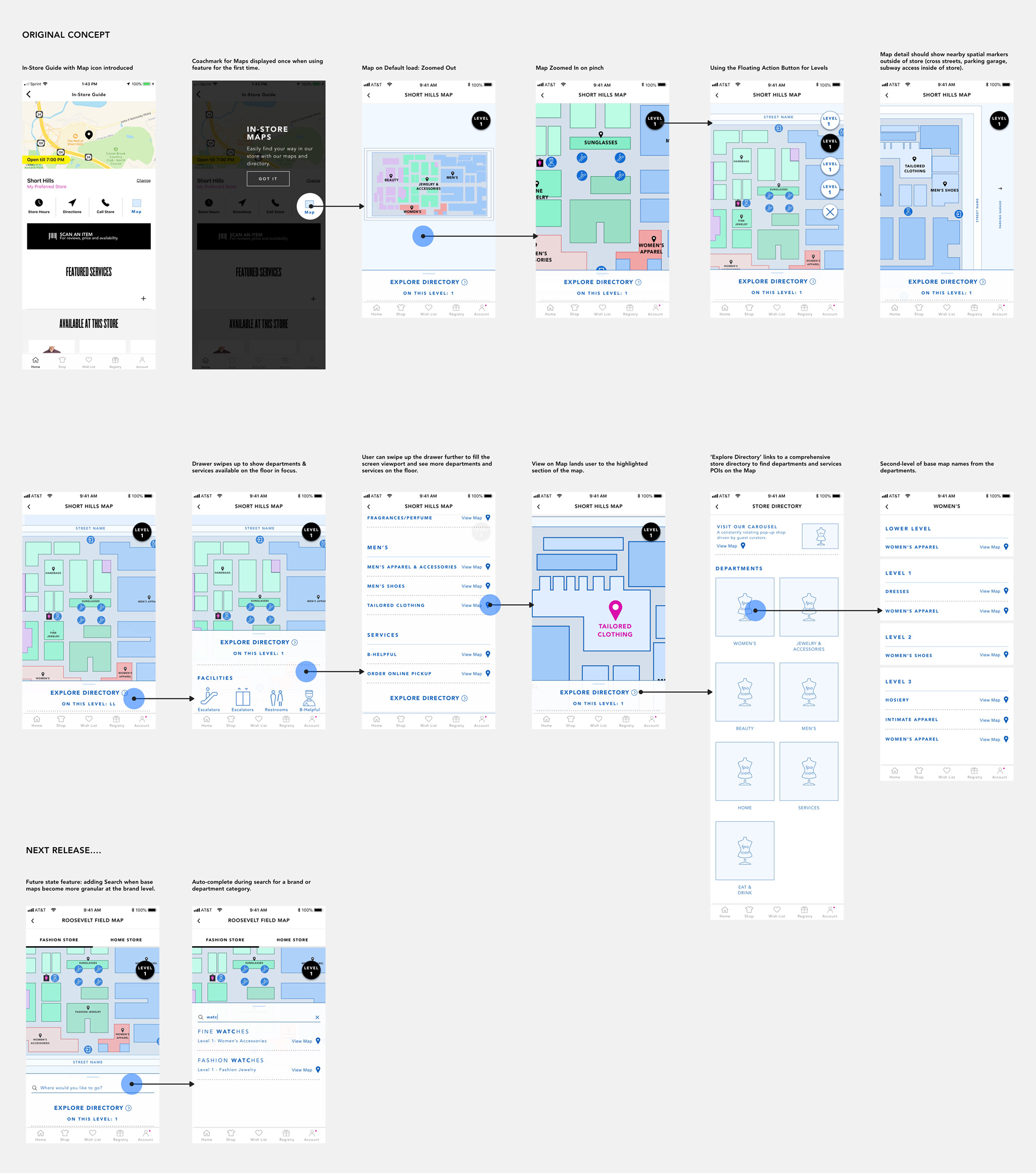 Sample iOS user flow of the Store Maps interaction, which was largely inspired by Google and Apple Maps. Over time, I had to park some ideas for Map functionality to meet the MVP, such as Search and the floating action button.
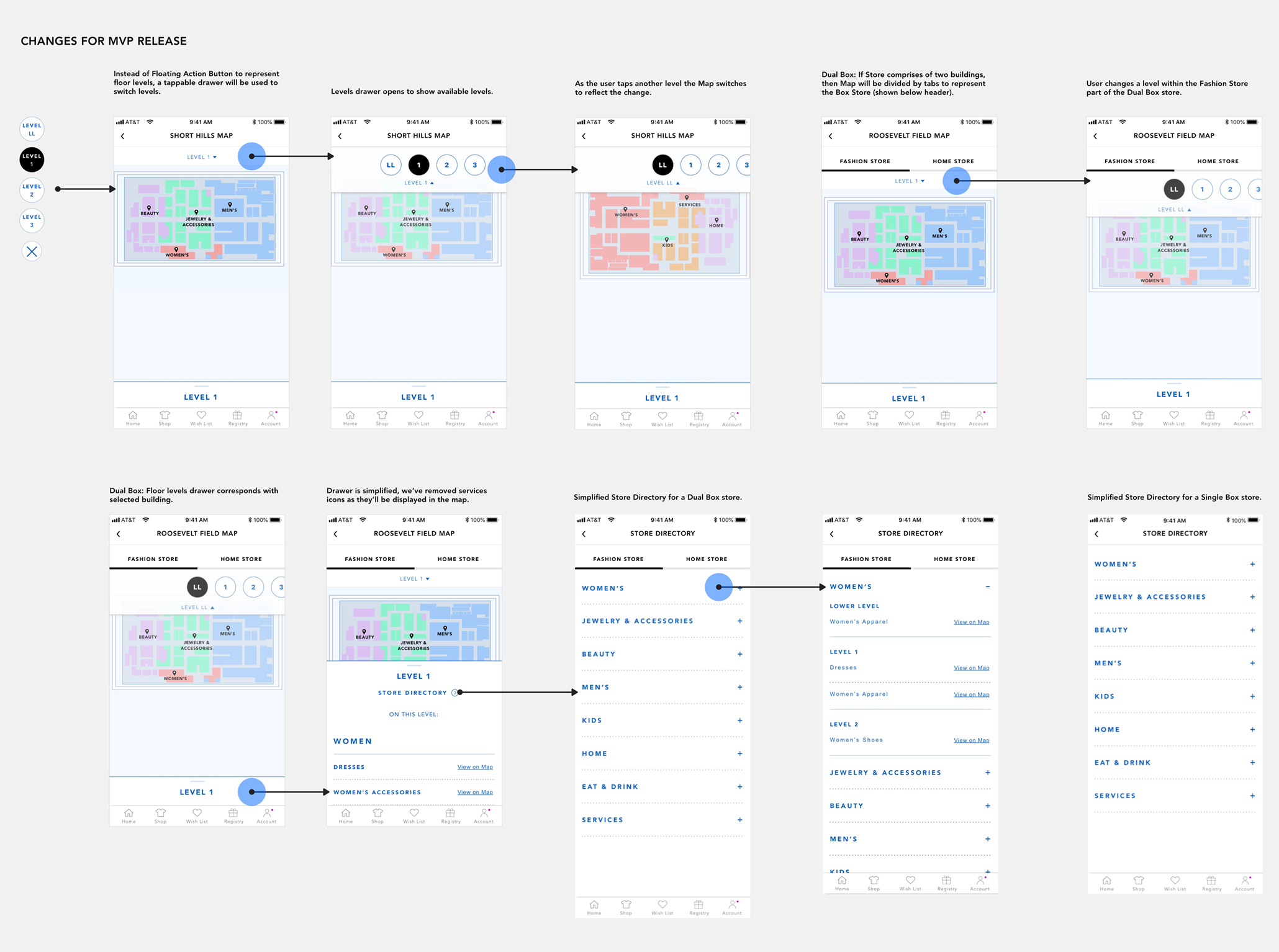 With development resource constraints the final iOS user flow for Store Maps was simplified to display the floor level selection above the map. The bottom drawer and store directory were also streamlined for the MVP.
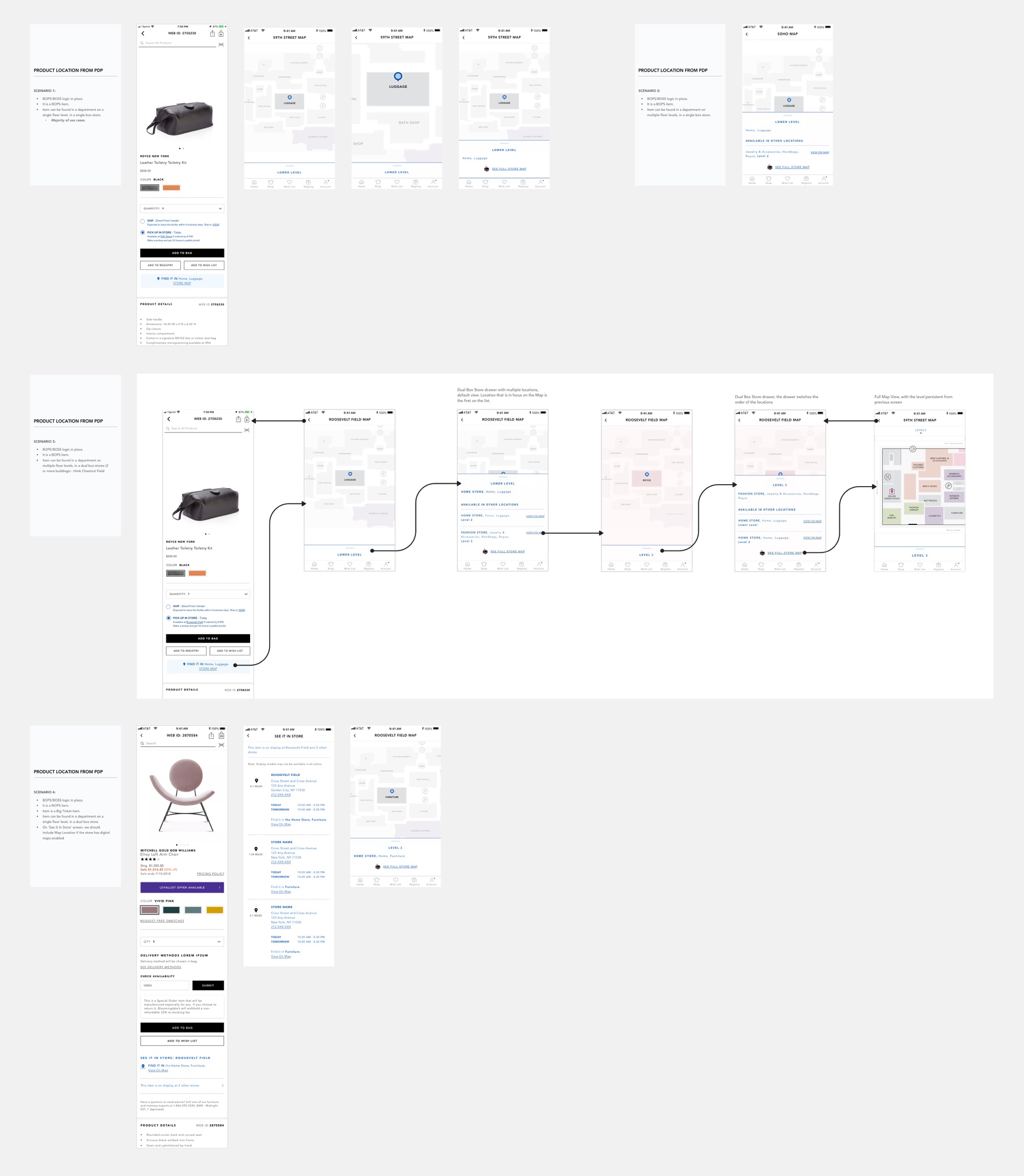 Some example scenarios for when the user is on a Product Details Page and is afforded the ability to locate the product on the availble Store Map.
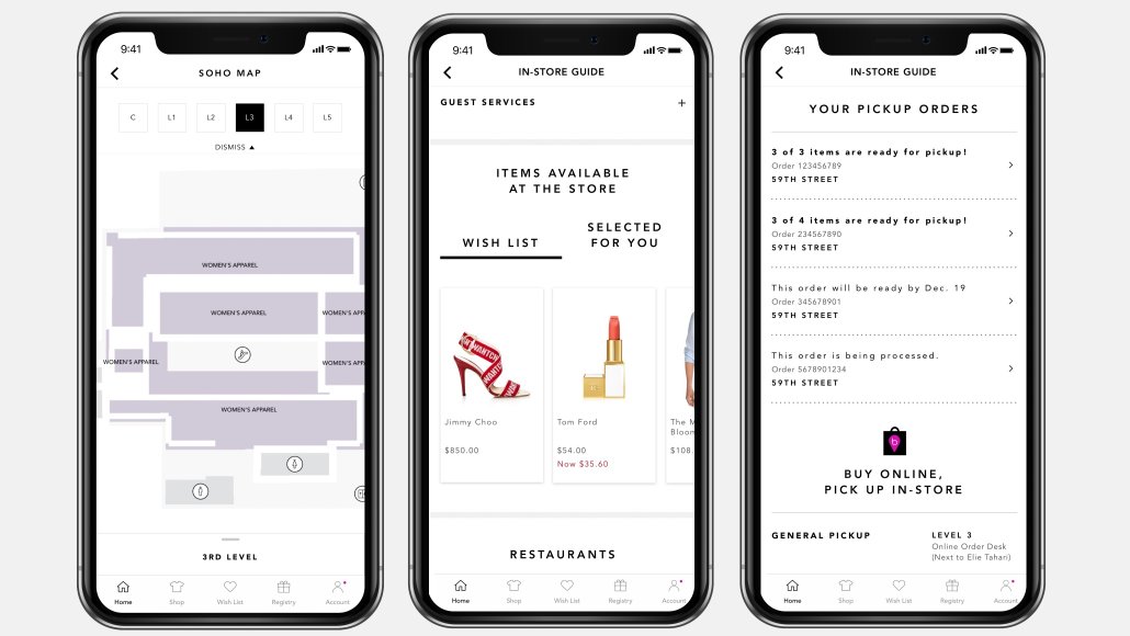
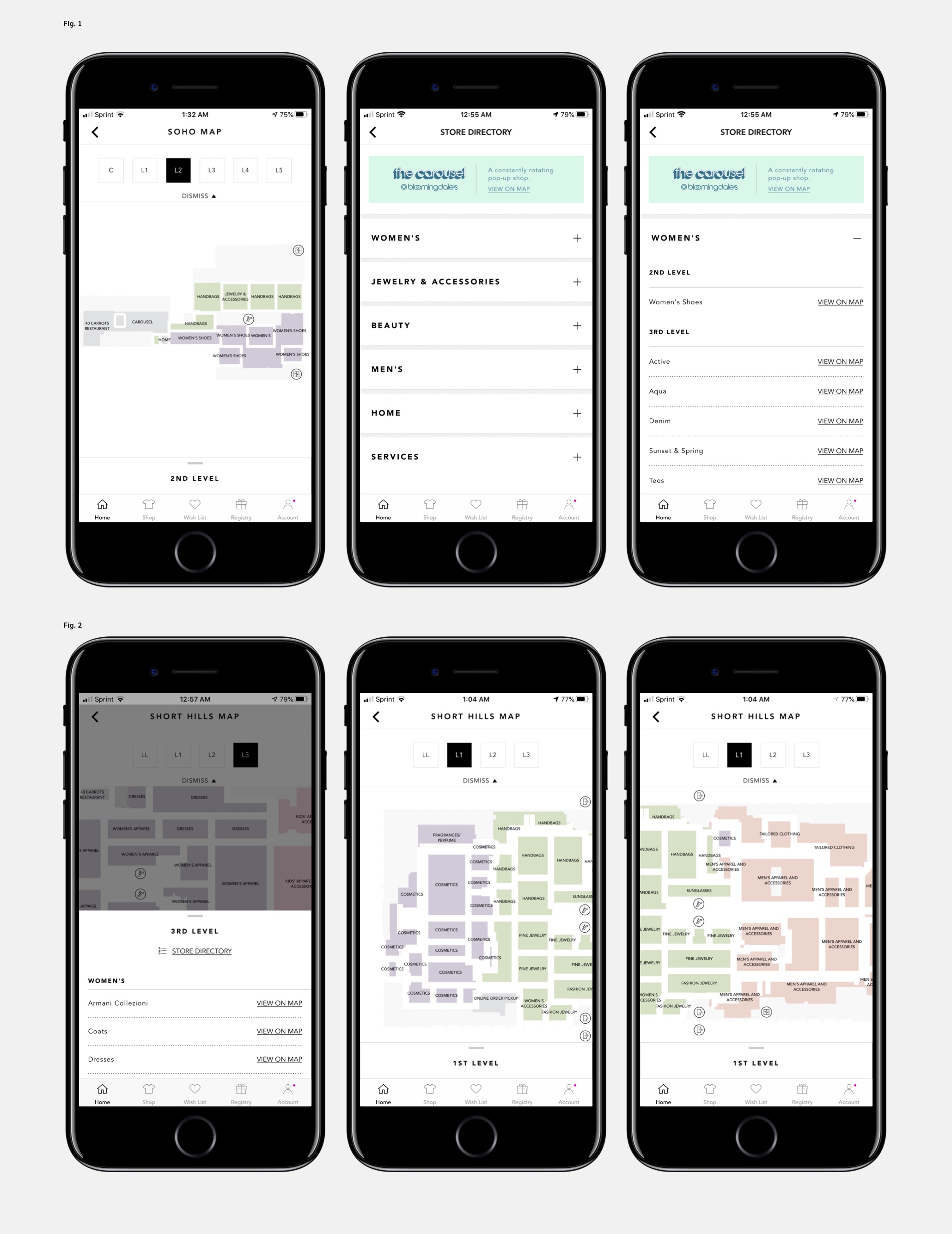 Today’s live Store Maps, powered by the UX functionality. Maps built by PointR. UI design is credited to our UI Creative team.
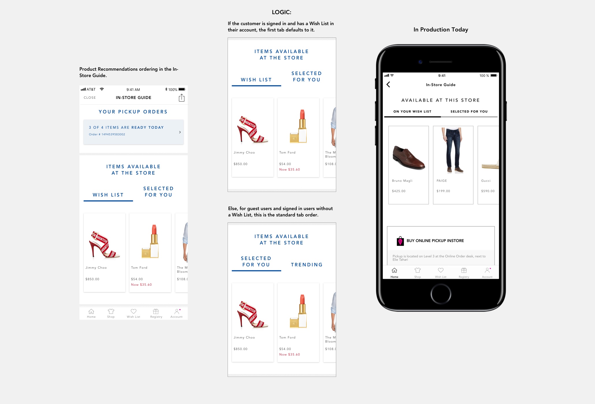 Displaying product recommendations on the In-Store Guide was another improvement to bridge the gap between the customer’s online and store browsing habits.
RESULTS AND NEXT STEPS
-
Store Maps was released as a pilot with a handful of store locations (including SoHo and Short Hills Mall). Post-launch a usability study was conducted by a 3rd-party research firm, noting that users had an overall positive experience with quickly finding departments and facilities; users cited the biggest opportunity for us is to surface an inline Search Bar feature within Maps (a feature I had originally designed, but had to deprioritize due to MVP timing constraints). The Maps experience scaled in the pilot stores. Next steps are to address the technical defects, scale Maps to all stores, and continue to build additional map features.
-
After a quick adoption of the Buy Online Pickup In Store Quick Pickup feature, it was scaled to all stores across the app. Next steps are to holistically reassess our app notifications for future in-store app announcements, and commit to further cleanup work on our Order Details screens.
-
Contextual Product Recommendations was scaled across all store guide locations. Next steps are to continue improving backend to support more hyperlocal product recs to customers.
-
Continue to optimize our app In-Store Guide experience to improve contextually relevant messaging and discovery of store features. This entails reorganizing the layout so the content structure is based on explicit and implicit customer behavior as they’re near a store, and to introduce features that will push customers to visit the store more often.